Jetpack Compose is a modern UI toolkit for building Android apps using a declarative approach. Shape in Jetpack Compose one of the key concepts for user interface, which is used to define the visual appearance of UI components.
A Shape is a geometric representation of a drawable element, such as a button or a card. It provides a set of properties that define the shape of the drawable element, including its size, corner radius, and other visual effects such as shadows or gradients.
Page Contents
Shapes in Jetpack Compose
First,
- Open Android Studio
- Create a new or open existing project
- Setup Project
build.gradle (project)
buildscript {
    ext {
        compose_ui_version = '1.4.0'
    }
}

// Top-level build file where you can add configuration options common to all sub-projects/modules.

plugins {
    id 'com.android.application' version '7.4.2' apply false
    id 'com.android.library' version '7.4.2' apply false
    id 'org.jetbrains.kotlin.android' version '1.8.10' apply false
}
build.gradle (module:app)
plugins {
    id 'com.android.application'
    id 'org.jetbrains.kotlin.android'
}

android {
    namespace 'com.techpassmaster.jetpackcomposeseries'
    compileSdk 33

    defaultConfig {
        applicationId "com.techpassmaster.jetpackcomposeseries"
        minSdk 24
        targetSdk 33
        versionCode 1
        versionName "1.0"

        testInstrumentationRunner "androidx.test.runner.AndroidJUnitRunner"
        vectorDrawables {
            useSupportLibrary true
        }
    }

    buildTypes {
        release {
            minifyEnabled false
            proguardFiles getDefaultProguardFile('proguard-android-optimize.txt'), 'proguard-rules.pro'
        }
    }
    compileOptions {
        sourceCompatibility JavaVersion.VERSION_1_8
        targetCompatibility JavaVersion.VERSION_1_8
    }

    kotlinOptions {
        jvmTarget = '1.8'
    }
    buildFeatures {
        compose true
    }
    composeOptions {
        kotlinCompilerExtensionVersion '1.4.4'
    }
    packagingOptions {
        resources {
            excludes += '/META-INF/{AL2.0,LGPL2.1}'
        }
    }
}

dependencies {

    implementation 'androidx.core:core-ktx:1.10.0'
    implementation 'androidx.lifecycle:lifecycle-runtime-ktx:2.6.1'
    implementation 'androidx.activity:activity-compose:1.7.0'
    implementation "androidx.compose.ui:ui:$compose_ui_version"
    implementation "androidx.compose.ui:ui-tooling-preview:$compose_ui_version"
    implementation 'androidx.compose.material:material:1.4.1'
    implementation 'androidx.appcompat:appcompat:1.6.1'
    testImplementation 'junit:junit:4.13.2'
    androidTestImplementation 'androidx.test.ext:junit:1.1.5'
    androidTestImplementation 'androidx.test.espresso:espresso-core:3.5.1'
    androidTestImplementation "androidx.compose.ui:ui-test-junit4:$compose_ui_version"
    debugImplementation "androidx.compose.ui:ui-tooling:$compose_ui_version"
    debugImplementation "androidx.compose.ui:ui-test-manifest:$compose_ui_version"
    implementation "org.jetbrains.kotlin:kotlin-script-runtime:1.8.20"
}
After creating the project create a composable function, here’s an example of how to create a shape in Compose:
RectangleShape
Card(modifier = Modifier
            .border(2.dp, color = Color.Blue)
            .padding(16.dp)
            .clickable{}
            .size(100.dp),
            shape = RectangleShape,
            border = BorderStroke(2.dp, color = Color.Red),
            elevation = 12.dp
        ){
            Box(modifier = Modifier
                .padding(8.dp),
                contentAlignment = Alignment.Center){
               Text(text = "Rectangle Shape",
               textAlign = TextAlign.Center)
            }
        }
RoundedCornerShape
Card(modifier = Modifier
            .padding(top = 16.dp)
            .size(100.dp)
            .graphicsLayer {
                shape = RoundedCornerShape(24.dp)
                clip = true
                shadowElevation = 12f
            },
            elevation = 12.dp
        ){
            Box(modifier = Modifier
                .padding(8.dp),
                contentAlignment = Alignment.Center){
                Text(text = "RoundedCornerShape",
                    textAlign = TextAlign.Center)
            }
        }
CircleShape
Card(modifier = Modifier
            .padding(top = 16.dp)
            .size(100.dp),
            shape = CircleShape,
            elevation = 12.dp
        ){
            Box(modifier = Modifier
                .padding(8.dp),
                contentAlignment = Alignment.Center){
                Text(text = "RoundedCornerShape",
                    textAlign = TextAlign.Center)
            }
        }
AbsoluteCutCornerShape
Card(modifier = Modifier
.padding(top = 16.dp)
.size(100.dp),
shape = AbsoluteCutCornerShape(16.dp),
elevation = 12.dp
){
Box(modifier = Modifier
.padding(8.dp),
contentAlignment = Alignment.Center){
Text(text = "AbsoluteCutCornerShape",
textAlign = TextAlign.Center)
}
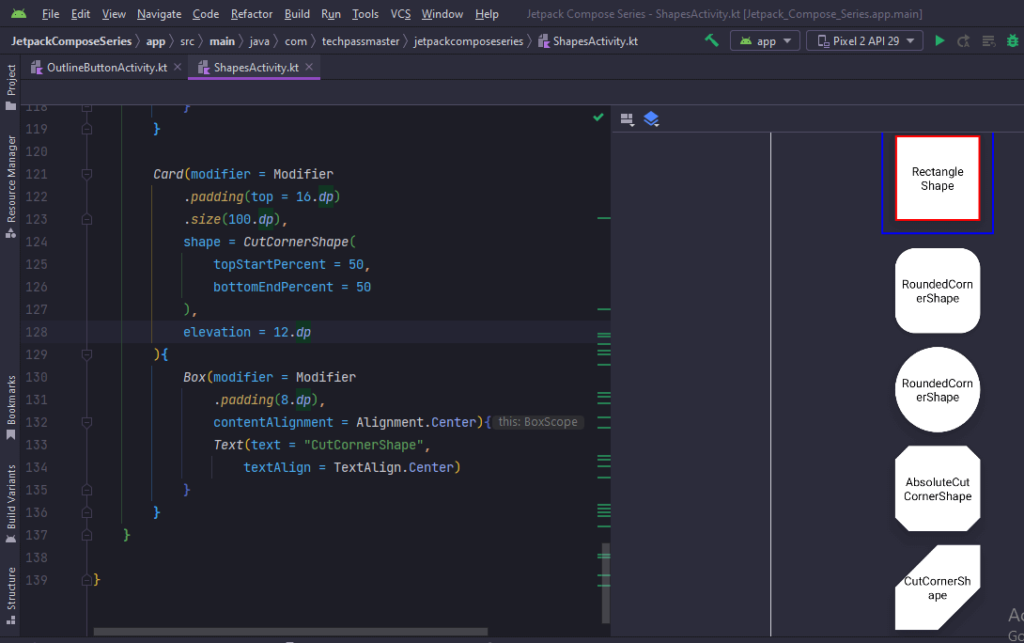
}CutCornerShape
Card(modifier = Modifier
            .padding(top = 16.dp)
            .size(100.dp),
            shape = CutCornerShape(
                topStartPercent = 50,
                bottomEndPercent = 50
            ),
            elevation = 12.dp
        ){
            Box(modifier = Modifier
                .padding(8.dp),
                contentAlignment = Alignment.Center){
                Text(text = "CutCornerShape",
                    textAlign = TextAlign.Center)
            }
        }
Complete Code
package com.techpassmaster.jetpackcomposeseries

import android.os.Bundle
import androidx.activity.ComponentActivity
import androidx.activity.compose.setContent
import androidx.compose.foundation.BorderStroke
import androidx.compose.foundation.border
import androidx.compose.foundation.clickable
import androidx.compose.foundation.layout.*
import androidx.compose.foundation.shape.AbsoluteCutCornerShape
import androidx.compose.foundation.shape.CircleShape
import androidx.compose.foundation.shape.CutCornerShape
import androidx.compose.foundation.shape.RoundedCornerShape
import androidx.compose.material.Card
import androidx.compose.material.MaterialTheme
import androidx.compose.material.Surface
import androidx.compose.runtime.*
import androidx.compose.ui.Modifier
import  androidx.compose.material.Text
import androidx.compose.ui.Alignment
import androidx.compose.ui.graphics.Color
import androidx.compose.ui.graphics.RectangleShape
import androidx.compose.ui.graphics.graphicsLayer
import androidx.compose.ui.text.style.TextAlign
import androidx.compose.ui.tooling.preview.Preview
import androidx.compose.ui.unit.dp
import com.techpassmaster.jetpackcomposeseries.ui.theme.JetpackComposeSeriesTheme

class ShapesActivity : ComponentActivity() {

    override fun onCreate(savedInstanceState: Bundle?) {
        super.onCreate(savedInstanceState)
        setContent {
            JetpackComposeSeriesTheme {
                // A surface container using the 'background' color from the theme
                Surface(
                    modifier = Modifier.fillMaxSize(),
                    color = MaterialTheme.colors.background
                ) {
                   ShapesInCompose()
                }
            }
        }
    }
}

@Preview
@Composable
fun ShapesInCompose() {

    Column(modifier = Modifier
        .padding(16.dp)
        .fillMaxWidth()
        .fillMaxHeight(),
        verticalArrangement = Arrangement.Center,
        horizontalAlignment = Alignment.CenterHorizontally
    ) {
        Card(modifier = Modifier
            .border(2.dp, color = Color.Blue)
            .padding(16.dp)
            .clickable{}
            .size(100.dp),
            shape = RectangleShape,
            border = BorderStroke(2.dp, color = Color.Red),
            elevation = 12.dp
        ){
            Box(modifier = Modifier
                .padding(8.dp),
                contentAlignment = Alignment.Center){
               Text(text = "Rectangle Shape",
               textAlign = TextAlign.Center)
            }
        }

        Card(modifier = Modifier
            .padding(top = 16.dp)
            .size(100.dp)
            .graphicsLayer {
                shape = RoundedCornerShape(24.dp)
                clip = true
                shadowElevation = 12f
            },
            elevation = 12.dp
        ){
            Box(modifier = Modifier
                .padding(8.dp),
                contentAlignment = Alignment.Center){
                Text(text = "RoundedCornerShape",
                    textAlign = TextAlign.Center)
            }
        }

        Card(modifier = Modifier
            .padding(top = 16.dp)
            .size(100.dp),
            shape = CircleShape,
            elevation = 12.dp
        ){
            Box(modifier = Modifier
                .padding(8.dp),
                contentAlignment = Alignment.Center){
                Text(text = "RoundedCornerShape",
                    textAlign = TextAlign.Center)
            }
        }

        Card(modifier = Modifier
            .padding(top = 16.dp)
            .size(100.dp),
            shape = AbsoluteCutCornerShape(16.dp),
            elevation = 12.dp
        ){
            Box(modifier = Modifier
                .padding(8.dp),
                contentAlignment = Alignment.Center){
                Text(text = "AbsoluteCutCornerShape",
                    textAlign = TextAlign.Center)
            }
        }

        Card(modifier = Modifier
            .padding(top = 16.dp)
            .size(100.dp),
            shape = CutCornerShape(
                topStartPercent = 50,
                bottomEndPercent = 50
            ),
            elevation = 12.dp
        ){
            Box(modifier = Modifier
                .padding(8.dp),
                contentAlignment = Alignment.Center){
                Text(text = "CutCornerShape",
                    textAlign = TextAlign.Center)
            }
        }
    }

}
Output
You May Also Like ⇣
- Text Padding in Jetpack Compose
- Clickable Text in Jetpack Compose
- Underline Text in Jetpack Compose
- Bold Italic Underline in Jetpack Compose