The combination of buttons with text and icons into enhances the visual appeal of your app, capturing the user’s attention and improving overall engagement. In this article, we’ll explore the Android Jetpack Compose Button with Icon and Text.
Page Contents
Getting Started with Jetpack Compose Button with Icon and Text
Let’s dive into the practical side. Setting up Jetpack Compose in Android Studio is the first step. Create a new Compose project, and you’re ready to enhance your UI.
Now, let’s write some code. Below are snippets demonstrating how to incorporate button with text and icon into your Compose project. These examples will serve as a foundation for your customization.
// on below line adding a button
        Button(
            modifier = Modifier.wrapContentHeight(),
            onClick = {
            Toast.makeText(ctx, "Clicked", Toast.LENGTH_SHORT).show()
        }) {
            Row(
                // on below line we are specifying modifier
                // and setting max height and max width for our column
                modifier = Modifier
                    // on below line we are adding padding for our column
                    .padding(5.dp),
            ) {
                Icon(
                    imageVector = Icons.Default.ThumbUp,
                    contentDescription = "Like",
                )
                // adding spacer on below line.
                Spacer(Modifier.height(10.dp))
                // adding text on below line.
                Text(
                    modifier = Modifier.padding(start = 12.dp),
                    // specifying text as android
                    text = "512",
                    // on below line adding style
                    style = TextStyle(fontWeight = FontWeight.Bold),
                    // adding text align on below line.
                    textAlign = TextAlign.Center,
                    // adding font size on below line.
                    fontSize = 20.sp
                )
            }
        }
Working with the ButtonWithIconAndTextActivity.kt file
package com.techpassmaster.jetpackcomposeseries
import android.os.Bundle
import android.widget.Toast
import androidx.activity.ComponentActivity
import androidx.activity.compose.setContent
import androidx.compose.foundation.clickable
import androidx.compose.foundation.layout.*
import androidx.compose.material.MaterialTheme
import androidx.compose.material.Surface
import androidx.compose.runtime.Composable
import androidx.compose.material.*
import androidx.compose.material.icons.Icons
import androidx.compose.material.icons.filled.ThumbUp
import androidx.compose.ui.Alignment
import androidx.compose.ui.Modifier
import androidx.compose.ui.platform.LocalContext
import androidx.compose.ui.res.painterResource
import androidx.compose.ui.text.TextStyle
import androidx.compose.ui.text.font.FontFamily
import androidx.compose.ui.text.font.FontStyle
import androidx.compose.ui.text.font.FontWeight
import androidx.compose.ui.text.style.TextAlign
import androidx.compose.ui.text.style.TextDecoration
import androidx.compose.ui.tooling.preview.Preview
import androidx.compose.ui.unit.dp
import androidx.compose.ui.unit.sp
import com.techpassmaster.jetpackcomposeseries.ui.theme.JetpackComposeSeriesTheme
class ButtonWithIconAndTextActivity: ComponentActivity() {
override fun onCreate(savedInstanceState: Bundle?) {
super.onCreate(savedInstanceState)
setContent {
JetpackComposeSeriesTheme {
// A surface container using the 'background' color from the theme
Surface(
modifier = Modifier.fillMaxSize(),
color = MaterialTheme.colors.background
) {
// call ButtonWithIconAndTextCompose composable function here
ButtonWithIconAndTextCompose()
}
}
}
}
}
@Preview(showBackground = true)
@Composable
fun ButtonWithIconAndTextCompose() {
// on below line we are creating a variable for a context
val ctx = LocalContext.current
Column(
// on the below line we are specifying modifier
// and setting max height and max width for our column
// on below line we are adding padding for our column
modifier = Modifier
.fillMaxSize()
.fillMaxHeight()
.fillMaxWidth()
.padding(5.dp),
// on below line we are specifying horizontal
// and vertical alignment for our column
horizontalAlignment = Alignment.CenterHorizontally,
verticalArrangement = Arrangement.Center
) {
Text(
"Text with Icon",
textAlign = TextAlign.Center,
style = TextStyle(
fontFamily = FontFamily.Default,
fontSize = 28.sp,
fontWeight = FontWeight.Bold
)
)
// on below line adding a spacer.
Spacer(modifier = Modifier.height(20.dp))
// on below line adding a button
Button(
modifier = Modifier.wrapContentHeight(),
onClick = {
Toast.makeText(ctx, "Clicked", Toast.LENGTH_SHORT).show()
}) {
Row(
// on below line we are specifying modifier
// and setting max height and max width for our column
modifier = Modifier
// on below line we are adding padding for our column
.padding(5.dp),
) {
Icon(
imageVector = Icons.Default.ThumbUp,
contentDescription = "Like",
)
// adding spacer on below line.
Spacer(Modifier.height(10.dp))
// adding text on below line.
Text(
modifier = Modifier.padding(start = 12.dp),
// specifying text as android
text = "512",
// on below line adding style
style = TextStyle(fontWeight = FontWeight.Bold),
// adding text align on below line.
textAlign = TextAlign.Center,
// adding font size on below line.
fontSize = 20.sp
)
}
}
}
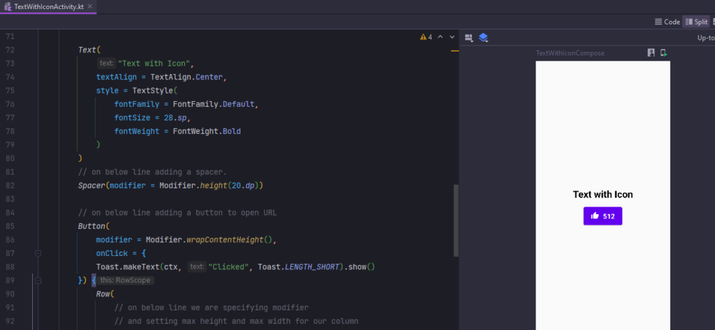
}Now run your application to see the output of it.
Output:
Conclusion
In conclusion, Jetpack Compose is a game-changer in Android UI development. Its seamless integration of button with text and icon into opens up new possibilities for creating visually appealing and interactive apps. Explore the potential, experiment with customization, and elevate your user experience.
You May Also Like ⇣
- Text in Jetpack Compose
- Clickable Text in Jetpack Compose
- Underline Text in Jetpack Compose
- Bold Italic Underline in Jetpack Compose
- ListView in Jetpack Compose using Android Studio