In Jetpack Compose, the Icon Toggle Button is composable, representing a toggle button with an icon. It allows users to switch between two states, like toggling between like and unlike. Let’s see the Step-by-Step Implementation.
Here’s a Step-by-Step Implementation:
Step 1: Create a New Project in Android Studio
To create a new project in Android Studio, Select Empty Compose Activity. If you do not find this template, try upgrading the Android Studio to the latest version and make sure you select Kotlin as the primary language while creating a New Project.
Step 2: Working with the IconToggleButtonActivity.kt file
Go to the IconToggleButtonActivity.kt file and refer to the following code. Below is the code for the IconToggleButtonActivity.kt file.
package com.codepassmaster.jetpackcomposeseries

import android.annotation.SuppressLint
import android.os.Bundle
import androidx.activity.ComponentActivity
import androidx.activity.compose.setContent
import androidx.compose.animation.animateColor
import androidx.compose.animation.core.*
import androidx.compose.foundation.layout.*
import androidx.compose.material.icons.Icons
import androidx.compose.material.icons.filled.Favorite
import androidx.compose.material.icons.filled.FavoriteBorder
import androidx.compose.material3.Icon
import androidx.compose.material3.IconToggleButton
import androidx.compose.material3.MaterialTheme
import androidx.compose.material3.Surface
import androidx.compose.runtime.Composable
import androidx.compose.runtime.getValue
import androidx.compose.runtime.mutableStateOf
import androidx.compose.runtime.remember
import androidx.compose.ui.Alignment
import androidx.compose.ui.Modifier
import androidx.compose.ui.graphics.Color
import androidx.compose.ui.tooling.preview.Preview
import androidx.compose.ui.unit.dp
import androidx.compose.ui.unit.sp
import androidx.compose.material3.Text
import com.codepassmaster.jetpackcomposeseries.ui.theme.JetpackComposeSeriesTheme

class IconToggleButtonActivity : ComponentActivity() {

    override fun onCreate(savedInstanceState: Bundle?) {
        super.onCreate(savedInstanceState)
        setContent {
            JetpackComposeSeriesTheme {
                // A surface container using the 'background' color from the theme
                Surface(
                    modifier = Modifier.fillMaxSize(),
                    color = MaterialTheme.colorScheme.background
                ) {
                    LikeUnlikeWithIconToggle()
                }
            }
        }
    }
}

@SuppressLint("UnusedTransitionTargetStateParameter")
@Preview
@Composable
fun LikeUnlikeWithIconToggle() {

    val checkState = remember { mutableStateOf(false) }

    Column(
        Modifier
            .fillMaxSize()
            .fillMaxHeight()
            .fillMaxWidth(),
    horizontalAlignment = Alignment.CenterHorizontally,
    verticalArrangement = Arrangement.Center)

    {

        Text(text = if(checkState.value){
            "Like"
        } else{
            "Unlike"
        },
            fontSize = 30.sp
        )

        Spacer(modifier = Modifier.height(16.dp))

        IconToggleButton(
            checked = checkState.value ,
            onCheckedChange = {
                checkState.value = !checkState.value
            }) {

            val transition = updateTransition(targetState = checkState.value, label = "")

            val myTint by transition.animateColor(label = "") { isChecked ->
                if (isChecked){
                    Color.Red
                } else{
                    Color.Black
                }
            }

            val mySize by transition.animateDp(
                label = "",
                transitionSpec = {
                    keyframes {
                        durationMillis = 250
                        120.dp at 0 with LinearOutSlowInEasing
                        125.dp at 30 with FastOutLinearInEasing
                    }
                }
            )
            {100.dp}

            Icon(
                imageVector = if (checkState.value) {
                    Icons.Filled.Favorite
                } else {
                    Icons.Filled.FavoriteBorder
                },
                contentDescription = "",
                modifier = Modifier.size(mySize),
                tint = myTint
            )
        }
    }
}
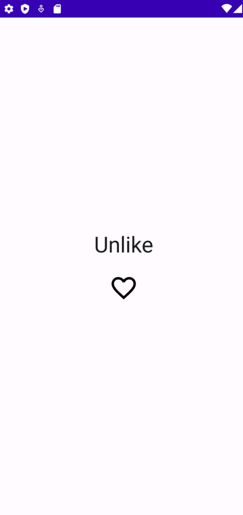
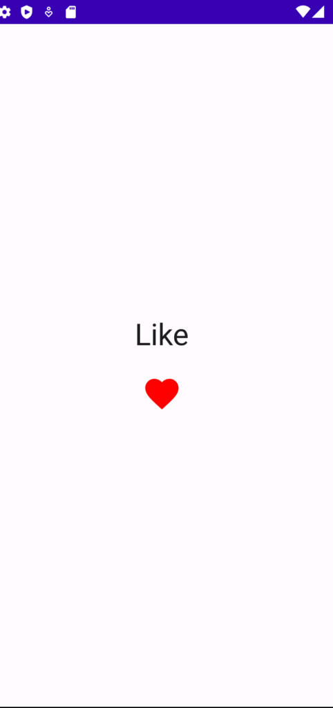
Now run your application to see the output of the Icon Toggle Button in Jetpack Compose.
Output:
You May Also Like ⇣
- Text in Jetpack Compose
- Clickable Text in Jetpack Compose
- Underline Text in Jetpack Compose
- Bold Italic Underline in Jetpack Compose